 20th Century Fox
- Much more 'show off' and proud, all aspects of the logo can relate to boldness which could reflect the company.
- The gold can relate to being precious and expensive
- The slightly low angle shot makes the item look very dominant and broad, which also fits in well with the big brass music.
- Moving lights creates a celebratory effect and makes the text seem very important, relates to
the fact the image is very statue like.
- The formal and posh surroundings make it look very high class and better than others.
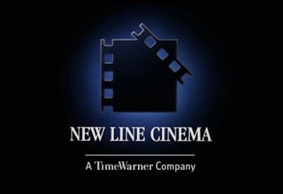
New Line Cinema

- It's a more mysterious and subtle logo that suits better with the horror film idea of being dark and having mysterious objects moving around.
- The small light glowing around he logo focuses attention towards the main item on the screen.
- The old fashioned text suggests that the films they make are aimed more towards the more mature audience or their brand is very sophisticated and formal.
- The parts of the logo fall separately towards the light, this could show how each element of their products come together towards success.
- The gentle, high pitched sound gradually becomes lower and is synchronous with the falling parts, however these ideas contrast with the iconography of a ladder

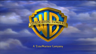
Warner Bros.
- Shaped like a super hero badge with the initials inside created the idea that they are 'heroes of film' and it can also relate well to children's interests, which is relevant to their films.
- The fact the logo is in the sky indicates that they are successful and also relates to the idea of being a super hero.
-The heroic music again emphasises this hero image and brand.
- The shiny gold colour represents wealth and value which could again encourage the hero idea even more.
No comments:
Post a Comment