Daryl Meadows AS Media
Thursday, 29 March 2012
Innocence
For our Main Task we had to use all of the research and practise we had gained throughout the course and produce a short film opening for a horror/thriller film. We opted for a psychological horror as that best suited the capabilities of an amateur film crew. We named the film 'Innocence' as it fitted in with the idea of the young girl, but contrasted what she had become. I had trouble uploading the video, so here is a link to our Horror Film Opening:
http://www.youtube.com/watch?v=a85dopk_OxA
Innocence - Evaluation
In what way does your media product use, develop or challenge forms and conventions of real media products?
After looking through various horror films, I discovered that they all have very similar characters and plots. There is always a killer if it’s supernatural or human, there is always a specific victim who is usually the main character and the story is usually based on the victim resulting in defeating the killer whether it’s in one film or after a series.
We found it fairly difficult to use all of the same conventions in the
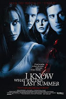 short opening, and however, I think we opened up the opportunity to do this. Our idea for the rest of the film was to go back to the time when she began to be possessed and develop the story from this point. The end repeats the opening again; this would make the audience feel slightly confused and have suitable effect on them- encouraging them to want to see the rest of the film. The way in which we finished the opening (and thus the ending), also allows for a sequel as she jumps towards the camera, This happens in ‘I Know What You Did Last Summer’(1997) which shows it can be a successful way to entice the audience. The way that we have chosen to order our story isn’t unique but it is uncommon which could make us slightly different and challenge audience expectations.
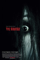.jpg) I also discovered that there are different types of horror films like; thriller, slasher, paranormal etc. however, we thought that they might be slightly harder to film as an amateur film crew, so we decided that psychological horror would be the most suitable route for our first attempt. I also personally believe that the scariest area of a horror film is the unknown. A shot that helped class our film as a psychological horror was when the daughter would be seen, and then suddenly she would disappear; this created uncertainty and put the audience on edge. We gained our inspiration for this shot from a part of ‘The Grudge’ where there is an over-the-shoulder shot of the creature before it suddenly vanishes in a super natural way, we found that shot effective and decided to regenerate a similar effect in our opening.
I also discovered that there are different types of horror films like; thriller, slasher, paranormal etc. however, we thought that they might be slightly harder to film as an amateur film crew, so we decided that psychological horror would be the most suitable route for our first attempt. I also personally believe that the scariest area of a horror film is the unknown. A shot that helped class our film as a psychological horror was when the daughter would be seen, and then suddenly she would disappear; this created uncertainty and put the audience on edge. We gained our inspiration for this shot from a part of ‘The Grudge’ where there is an over-the-shoulder shot of the creature before it suddenly vanishes in a super natural way, we found that shot effective and decided to regenerate a similar effect in our opening.
We kept similar characters in our film as we had the main horror character, or ‘the killer’, and we had a single mum trying to control the situation as it grows out of her hands, this was the base of our characters but if we were to shoot the whole thing we would introduce more conventional characters as I think they are necessary to generate a good horror film
How does your media product represent particular social groups?
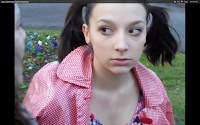 In the short opening sequence we only had two characters one a young girl, the other a single mum, these work well together as they can obtain a good relationship but the difference being that the young girl is possessed. The girl is very young and we tried to portrait this better by giving our actress ‘pink tails’ in her hair as this enhances the childlike features because she is so young when we reveal the fact she is possessed it dramatically changes the way the audience feel about her and affects the way she presents that social group. She was dressed in a casual red dress and a red coat which she removed during the opening, this clothing isn’t anything special and she still looks like a normal young girl, however, the red colour could represent the fact there is danger within her; this would also put pull her away from the typical view of her social group. We felt the park was quite a suitable place for the pair of characters as it is supposed to be quite a friendly, family environment so by adding this supernatural unknown, the danger escalates and makes the audience worried.
 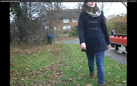 The mum, however, is very much the common expectation of what you would expect from a character like her; she is constantly worrying over her daughter; dresses in darker, dull clothing. The type of coat is very basic with no eccentric additions showing that she is mature and level headed. It also shows that she her wealth can just get the necessary clothing but not much else, suggesting she doesn’t have a particularly high status in society. These features make her a more down to earth character and one that the audience can relate to better. She also comes across very caring, she fits in well with the typical view of that social group primarily because her main interest would be her daughter’s well-being.
What kind of media institution might distribute your media product and why?
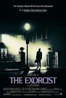
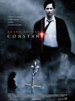
Horror films often have sub-genres and I felt that our film opening can be classed as a psychological horror or supernatural thriller as it is about a possessed girl and her story as the demon within, slowly takes over. There were various films around that are based on possessed people; I also found that exorcism films slightly related to the same category so as these closely relate to our film I researched the production companies that make them. I found that Warner Bros., despite it being an unlikely consideration, made a few similar films, for example Fallen(1998), which wasn’t particularly successful, however The Exorcist(1972) balanced this as it has been nominated for 10 Academy Awards and 7 Golden Globes, from which they won 6 in total, which suggests that these films can be successful. Constantine(2005) also managed to generate $230,884,728 at the box office and The Wicker Man(1973/2006) clearly the 1973 success encouraged the remake, which was also perceived well showing that this type of film is still good for the modern day film industry. Each of these films would have displayed similar conventions and ideas and therefore would have been directed towards a similar audience so I felt Warner Bros. had the potential to produce our film, also I think the success that was generated from these films suggests that psychological horror is a genre that is still appreciated by the audience.
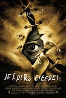
 However, whilst researching I also discovered that United Artists might also produce our film as I found a similar number of films that they had made that generate similar psychological fears as other ‘possessed’ films. For example they made films such as Jeepers Creepers(2001) which had a low budget and still managed to generate nearly $60 million at the box office. Another example would be Burnt Offerings(1976) that achieved six awards including best horror film and best director also Carrie(1976) received great reviews such as one from ‘The Movie Guide’ that named the film " the landmark horror film" as well as being successful enough to gain the equivalent of $135 million in today’s money. Again with the ideas and fears shown with these films I also believed that they could possibly distribute our film.
Who would be the audience for your media product?
Typical conventions of psychological thrillers may effect the type of audience that would enjoy watching our film, for example, psychological horrors tend to contain less gore and blood, this can make our horror film more suitable for squeamish viewers. Horrors like ours can relate to the audience and demonstrate scary stories from everyday situations which can enhance the fear of it happening to you, these type of films are also slightly slower and more based around tension building and mental fear. I think that these features appeal more to women, because I think that men enjoy watching more physical/gory horrors.

 After interviewing several people from different social groups specifically about horror films, I established that teenage boys prefer the gore and physically scary films compared to the girls who either don’t particularly like them at all or are very open minded. I spoke to some adults on their perspective of horror films and also discovered that males still enjoy the physically scary films, however a few responses would suggest that they are more open minded towards horror as they are older. However, the main point was that the majority of older females mentioned how psychological horror and suspense were the main things that they like from a horror film as they feel its something they can relate to, so I think that definitely helped narrow down the target audience. Some of the films that were mentioned were the extremely successful ‘The Sixth Sense’(1999) that received $673 million, another film was ‘Silent Hill’(2006) which was also considerably successful bringing in nearly $100 million. These two films both contain the idea of children being involved which mum’s will often find quite a scary idea. We used this information to create our film around the idea of the Mum loosing their child so we think it could be successful. I also believe that psychological thrillers are more for the patient/tension aspect and so teenagers may not be as interested due to the slower pace of the film, this would suggest that the target audience of our film is Women aged 20+.
Another consideration as to which women would watch this film would be income, if someone has a low income, possibly unemployed, they may not be as inclined to spend money they do not have for the cinema. Alternatively those who are employed are more likely to be the ones willing to spend disposable income on the film. However, women that have full-time careers may not have the time to sit and watch a film, this could interrupt the idea of working women being the ones to watch it, however, part-time workers may have the money and the time to watch our film, so our prioritized target audience would be part-time working women aged 20+.
My mum is an ideal example of our target market as she is a female part-time worker of the ideal age, as a part-time worker she is able to use the extra free time available effectively to free up weekends slightly better, this could give her time to travel to a cinema and watch our film. She doesn't have many hobbies or interests, as she likes to allow herself as much free time as possible, however she does watch television in the evening and enjoys listening to the radio. She is also a fan of psychological films, especially those that have a twist, so if we had created our full film it could appeal well to her.
How did you attract/address your audience?
As I mentioned before, we did some market research and discovered that there is an audience out there that would like to watch our film. With the target audience I just mentioned we would look to create a trailer as I would judge our audience to be people who watch television, ideally it would be between television programmes such as soap operas like Coronation Street or cooking programmes, they don't really have a lot of relevance to our film but both types of programmes that I believe they would watch. However, due to the watershed hours we would not be able to show a horror film advert at these times, so from our research we asked what television programmes they watch between 9:00 and 5:30, these programmes included more serial dramas like ‘Being Human’ and ‘Whitechapel’ which do actually fit in well with the horror genre, so this could be an optimum position for our adverts.
 From the research that we discovered I wouldn't consider our target audience as being big YouTube fans so I don't think it would become majorly successful through viral videos, as that may be better aimed for teens, although I do believe they use social networks like Facebook and Twitter so we could aim to get adverts on there or try and generate a viral campign using them instead of YouTube. Also, in regards to radio stations I think the likes of BBC Radio 1 and 2, HeartFM, Magic or CapitalFM would be ideal radio stations to cover the majority our target audience, as national stations that can also be a good advertising slot, as I mentioned before, my mum is a fan of these stations so she would definitely be aware of the film if it was advertised this way.
 I think the ending of our opening would be a particularly useful part of the film in terms of interesting the audience, as it is a scary moment that can make the audience interested in what happens next and possibly why it happened. The contrasting image of an innocent young girl with the inner demon she has become is quite an odd personality trait and could also be something that would interest viewers.
What have you learned about technologies from the from the process of constructing this product?
 Final cut was completely new to me as a film editing software and particularly jumping from windows moviemaker to that required me to get used to the new software; I felt that I managed the software well.
On the parts of editing I was responsible for, I found the rendering aspect to be quite annoying and awkward as it added considerable time to complete the editing but the rest of the software contained similar abilities as moviemaker. It just required a bit of attention to work out how to complete certain tasks.
In regards to filming we found that on our first trip to Weston where there was an ideal location, the camera ran out of battery during filming so we had to wait a considerable number of days before we could begin filming again due to other commitments that prevented people from being available. After this time we decided to change our location as the other position wasn't practical enough, but we did learn from the mistake and were sure to charge the camera before filming. We decided that during our film we would have parts where the daughter would suddenly disappear or appear; this required difficult and well-timed camera work and more takes than other scenes and despite many attempts still came out quite amateur.
We felt our non-diegetic music was good and we were easily able to download it from the Internet and put that straight on our film, this was straight forward but effective and, in my opinion, one of the more important parts of the film. Also at the beginning we added the tune of ‘twinkle twinkle little star’ which is a classic nursery rhyme, but in the film it came across very sinister and was depicted completely differently to the standard expectation of the music. The diegetic sound included shouts from the mum, otherwise we didn’t include anything else as the silence throughout the film built up tension and intrigue so we thought it was effective.
Looking back at your preliminary task what do you feel you have learnt in the progression from it to full product?
I felt that we had various similarities and differences between our two tasks, one similarity if the fact that both films have quite a mysterious element to them and the audience aren't particularly sure about the whole story and this could encourage them to want to find out more. I also think our sound is similar because we were trying to generate tension and anxiety which required good non-diegetic sound, I believe this was achieved well in both.
I found that our preliminary task wasn't great when looking at continuity issues however because we made this mistake with our practice task we were able to be more aware of it with our main task. For example, a minor issue that we remembered to keep the same was which hand the mum held the coat in, this was quite an insignificant part of the film but something we had to bare in mind, so we were able to get a slight idea of what real film crews have to think about. I also think we came to a better realization as to how long it actually takes to film so we were able to account for this for our main opening and with. Our better time management the battery problem didn't become as major as it could have. There were a couple of things that didn't work as well as the preliminary task, for example, the editing for the first task was done on windows movie maker which meant it was faster and still effective as I was able to complete it in one night, however due to the fact we had to use a Mac it was harder for us to gain access to one and the rendering aspect took a while so it took about a week to complete editing. Also with our first task I manned the camera and did the editing, this worked well as I was able to film what I knew would work when editing however because we distributed the jobs more fairly I filmed whilst having less input on the editing so there had more potential to be clashes of visual thoughts or ideas, I think that our group worked well together so this wasn't a huge problem.
Monday, 26 March 2012
Innocence - Analysis
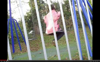 This is a low angle shot and the bars the
come over the camera can suggest the idea that she is trapped and has no escape from the events that are about to happen. The slightly canted angle enhance the fact that there is something wrong and almost foreshadows the unfolding events. The girl is wearing a small, pink coat that represents the stereotypical view of someone from that group of people, the psychological horror comes from the fact that we contrast this typical image with an inner demon so the clothes are quite effective.
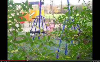
This is a long panning shot of the main character, it was shot through some bushes and created a slightly disturbing view for the audience as it felt like the audience are on the bad side watching the little girl. This sensation is emphasised with the panning movement as it gives the s
ense that they are slowly creeping behin
d th
e bushes, the fact that you can see her in a small gap in the bush makes her look like the target. This is also enhanced with the fact it is a long shot that makes her look more vulnerable with the greater area of surroundings.

This is a high angle shot of the mum as she searches near the park to find her, we felt this was an effective shot as the bars and gates around her generated the idea of being trapped particularly with the 'prison' like bar pattern. She is prevented from continuing her forward movement which can suggest how this change has effected her life and it will never be the same. The high angle shot
makes her look vulnerable as well and
the overhanging trees 'looking down on her' emphasises this. The religious connotation within this shot is an idea that she has been given two pathways to choose between, and she opts for the right one, we thought that this can relate to the idea of having a devil and an angel on your shoulder as, typically, the devil is on the right one. The plants surrounding her are also quite dead and lifeless which creates a deathly feel to the shot and foreshadows the possible events that could involve her.

This is a slightly low angle shot and it pictures her walking away from the camera, this could suggest that she is slowly losing control and stability of this situation. As she moves
away she seems to become more vulnerable because the surroundings increase on the screen making her seem insignificant. The fact she is holding her daughter's coat shows that she is determined to keep hold of her daughter and
will not give up searching, this is a good representation of a typical mum. The bars on the gate that she walks through also suggests the idea of her being trapped in this situation and that she has little way of escaping it.
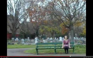
This is an extreme long shot of the girl sitting on a bench by a tree, again the long shot makes her look very small and vulnerable however the controlled way she is sitting suggests that she isn't as timid as she seems. The connotation of the tree behind could indicate how the problem is growing from her and the inner demon is growing and taking over the innocent girl. The tree is dull a
s it can foreshadow the future problems that will occur because of this. The graveyard setting is a very typical convention of the horror genre and something that we picked up on as a good psychological fear that presents death and mourning, so we felt it was a suitable location for our opening.

This was the final shot of our opening before the film faded to black. This was a very sinister shot and the idea of making the character more of a dark silhouette makes her seem much more scary and mysterious. The low angle shot used here is the ultimate reason as to why this shot is so effective as it makes her look much bigger and far more daunting, especially when you cannot see her facial expression very clearly. I think that the fact we were able to turn a friendly, innocent looking girl into a scary figure with this shot shows good creativity and is very suitable for our psychological genre.
Film Institutions - Logos
 20th Century Fox
- Much more 'show off' and proud, all aspects of the logo can relate to boldness which could reflect the company.
- The gold can relate to being precious and expensive
- The slightly low angle shot makes the item look very dominant and broad, which also fits in well with the big brass music.
- Moving lights creates a celebratory effect and makes the text seem very important, relates to
the fact the image is very statue like.
- The formal and posh surroundings make it look very high class and better than others.
New Line Cinema
- It's a more mysterious and subtle logo that suits better with the horror film idea of being dark and having mysterious objects moving around.
- The small light glowing around he logo focuses attention towards the main item on the screen.
- The old fashioned text suggests that the films they make are aimed more towards the more mature audience or their brand is very sophisticated and formal.
- The parts of the logo fall separately towards the light, this could show how each element of their products come together towards success.
- The gentle, high pitched sound gradually becomes lower and is synchronous with the falling parts, however these ideas contrast with the iconography of a ladder
Warner Bros.
- Shaped like a super hero badge with the initials inside created the idea that they are 'heroes of film' and it can also relate well to children's interests, which is relevant to their films.
- The fact the logo is in the sky indicates that they are successful and also relates to the idea of being a super hero.
-The heroic music again emphasises this hero image and brand.
- The shiny gold colour represents wealth and value which could again encourage the hero idea even more.
Sunday, 25 March 2012
Audience Research
To get a better understanding of the audience that our film company would want to aim for I did some market research, this involved me asking questions to various people and use the data to make a judgment. Due to the restricted resources available I was only able to talk to some similarly aged students which doesn't give a useful understanding but could suggest a rough estimate or outline of general trends.I found that the use of social networking was useful here as it allowed me to communicate effectively without face to face interaction and ii am able to complete the research from home, as evidence I took screenshots of the messages i sent out.
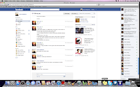




The questions I asked were:
1. What is your favourite film genre?
2. What are you top 2 films?
3. How often do you watch films?
4. Where is the most common place for you to watch films?
5. Where do you find out about various films?
6. Do you watch horror films?
7. What is your favourite sub-genre of horror films?
8. What do you like/dislike about horrors?
9. What are your top 2 horror films?
I created some charts to give a clearer indication of what audiences prefer:

This Chart establishes the more popu
lar places for teenagers aged 16/17 to watch
films, i found out that the bedroom or at home were the most popular places suggesting that the majority of the time teenagers will watch a film alone, or with family, in their own time. This isn't directly useful but it can allow us to understand who will be watching our films so we used this to create a film that can be scary, which fits the desire of an individual but as we also made our film appealing to a range of difference market segments it could also appeal to the whole family, fitting in with watching films at home the families would need to be older and have no small children so it remains appropriate but each generation could enjoy it.

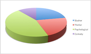
This chart can show what sub-genre is the most popular for horror films, clearly psychological is by far the most popular and we used this information to help decide what type of horror we would make. I think the research became useful here as it demonstrates that we would gain more interest creating the psychological horror than we would from other horrors, this can generate higher revenue from sales making the film successful.
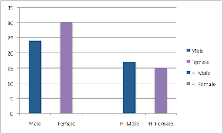 This graph shows how many films each gender collectively watch each month, the first pair of bars are about films in general and the next two are based on horror films. Interestingly both genders watch a lot of horrors which would suggest that the horror genre is popular amongst this age group. Also females tend to watch more films in general which could make you think that they are the target audience however when specifying horror films males actually watch more of them so appealing to them should gain more revenue through sales.
From the questions I also found out that the majority of students who disliked horror it was often due to the graphic images that can be considered disturbing, i feel that as our horror film is a psychological horror we do not contain any of that content. This means that our film could still be interesting for the population that tend to dislike horror films, alternatively it was occasionally mentioned that the anticipation and suspense before a scary moment is something that is disliked, this could mean that our film isnt as good for them so appealing to that audience will be dificult to judge.
But for nearly everyone who likes horror films it was said that the suspense is one of the reasons they are so good, so we will definitely appeal to that market.
Preliminary Task - Analysis
For the preliminary task there were a few shots that we believed stood out as good ones where the representations of the film were well presented through various media techniques. The shots that did this were:
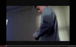 This is a low angle shot and gives the character a dominant power over the audience and suggests that he is of importance. We later go on to realise that the object he is holding could be the reason why he is important. The dark shadows in this shot create an eerie atmosphere as we get the impression that danger is near and in this shot he is walking towards darkness which foreshadows his death.



 This is a low angle shot and gives the character a dominant power over the audience and suggests that he is of importance. We later go on to realise that the object he is holding could be the reason why he is important. The dark shadows in this shot create an eerie atmosphere as we get the impression that danger is near and in this shot he is walking towards darkness which foreshadows his death.
This long shot of the character is shot through
a door and the pattern ov
er the glass creates the idea that he is trapped in this situation, also the fact that he is walking away from the camera, leaving it behind, can show that he won't reveal his full identity.
The light that's emitted from the door can suggest representations of heaven, and going
through there will lead to his death, which we know does.

This close-up of his feet at the door can show how it's his mind leading him to this place, not his heart, or he feels he shouldn't be there but his lead himself there anyway.
Again the dark shad
ows represent the idea of death, the bright light on the side furthest from the door could possi
bly be a signal that his only chance of life would be escaping now.

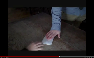
This shot is shows the meeting of the two characters through this object that is being traded, in this shot the male character qui
ckly removes his hand when the female
one touches the object, this is to show how he is trying to avoid all contact with her. The object is in the centre of this shot and the importance of it is shown through the fact it is in the middle, the slightly canted angle suggests that the dealing isn't very straight and that something is wrong.

This is an over shoulder shot looking towards the female character, in this scene we see the two characters change in dominance as the male sits down when he passes over the object and the female character stands up. This also emphasises the importance of the object as the person in possession of it appears the more dominant character, that was the intention behind this shot.
Preliminary Task
We had a practice at filming with a preliminary task, the criteria was that someone had to walking down a corridor into a room, give something to someone and they should react. This needed to be done with minimal dialogue, here is our short film:
Subscribe to:
Comments (Atom)